Type is something we see and interact with each and every day but the creation and minds behind the letterforms themselves is generally forgotten. The designing process behind a typeface is a lengthy and elaborate, from the decision from the mood you want to portray, the ascender height, and the tiddle.
When creating my typeface we were asked to build it off of an already existing typeface, I chose Franklin Gothic. Franklin Gothic is a simple straight forward sans-serif, modern typeface, with subtle stroke contrast. For the design of Morris my three intended attributes were to make the typeface playful, sophisticated, and lively while still letting the base letterforms of Franklin Gothic show through.

The name Morris connects back to Franklin Gothic with the designer of typeface being named Morris Fuller Benton and me with my family being from Morristown, New Jersey. I found it important to name my typeface something that gave credit to Franklin Gothic but also connected to me.

In the beginning of the design process I started with quick rough sketches what I would like to letterforms to look like while also making sure my three attributes for my typeface come through clearly. After the sketching, I moved into illustrator where I created them and I then imported them into GlyphsMini.


Morris has round cornered triangular serifs, which produces a soft feel. The typeface is also accompanied with a few ligatures connecting one letter form to another which gives. Above you can see Franklin Gothic (gray) compared to Morris (black).

Pictured above are a few characters and ligatures I created. It is extremely important that each character and letterforms from a typeface are seen as a set and come off as a whole.

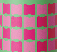
A few "tasty bits" from my typeface made into pattern designs, I incorporated the tittle used in the lowercase i and j, my ul ligature, and a piece of the lowercase n in my designs.

One of my attributes for the design on my typeface displayed metaphorically.